Creating a User Experience without a User Interface
There isn’t a day that goes by where I don’t talk to Alexa. Currently, I have her setup to give me briefings on the news from three different sources, then I play a “quick” game of Jeopardy and end my morning routine with a minute of quiet meditation.
It isn’t just me. My parents, aunts, uncles, cousins, you name it – all also use Alexa to call each other, play music, or launch games.
This is where my curiosity initially peaked. I wanted to play a game but she didn’t have a skill for it. Therefore, I had to create it for my friends and family to play.
So, where does one start when creating an Alexa skill?
The same place as with any other digital application: defining functionality and architecting the user experience (UX) – which just so happens to be my specialty here at MEDL Mobile. So, in the interest of demystifying and sharing what we know about tech, I’d like to share what it takes to build an Alexa Skill – starting in this post with Step #1:

There’s a difference between a digital assistant and a mobile application and people interact with them very differently. iOS, Android, and web are visual platforms. Users are used to seeing (and sometimes even feeling) feedback when they interact. On the other hand, users talk to Alexa. If the code’s script that Alexa reads from is done poorly, the illusion is broken which leaves users reminded that they are just talking to a robot.
When designing a mobile interface, my goal is to make it feel visually familiar and intuitive. My goal for designing an Alexa interface is to make it feel like a conversation.
But a conversation about what?
When doing UX wireframes for mobile apps, I like to start with the biggest broad-stroked picture and ask myself a few fundamental questions:
What will the app, or in this case the skill, do for the user?
How will they interact with each component?
What happens if the user is new?
What happens if they are returning?
What if they need help or don’t know what something means?
Questions like those help me understand the client’s wants, needs, and desires for a product which can be broken down into priority and future features. And in this example, they help me write the script – and create the conversation – between my Alexa skill and our users.
What will the app, or in this case the skill, do for the user? It will be a game that lets the user play movie trivia.
How will they interact with each component? Alexa will read a quote from a movie and the user needs to guess what movie it’s from. Extra points if they identify the actor or the name of the role.
What happens if the user is new? Alexa will explain the rules of the game.
What happens if they are returning? Alexa will not ask them the same quote twice without going through the entire quote database. Alexa will remember their current score.
What if they need help or don’t know what something means? They can ask for help and Alexa will explain the rules of the game.
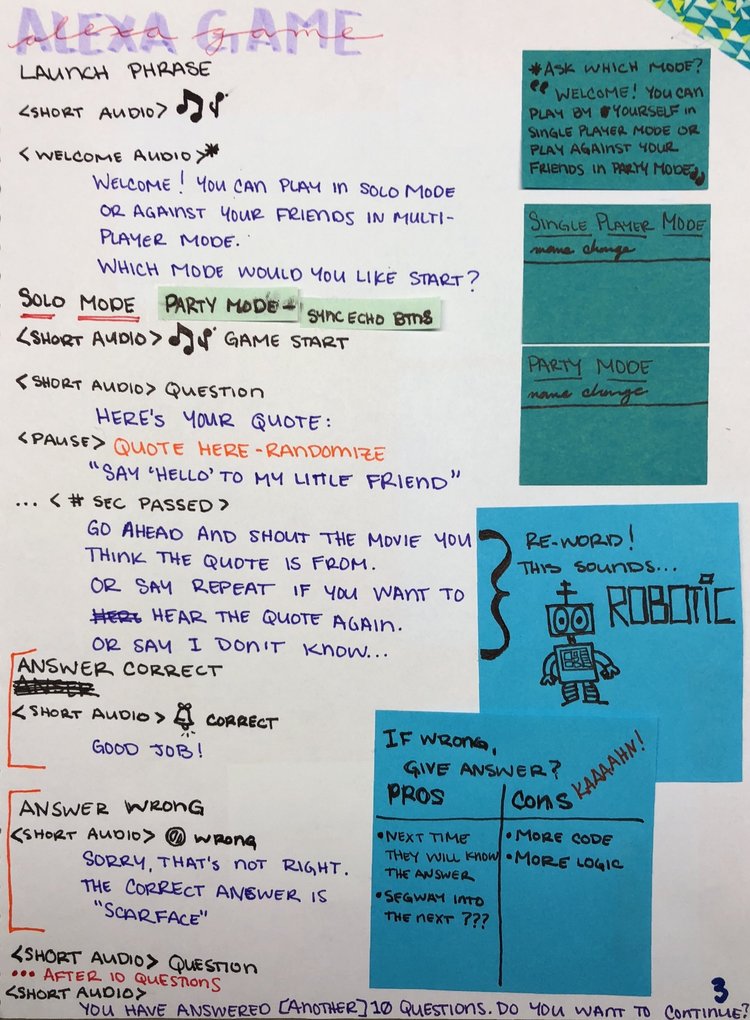
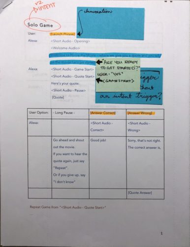
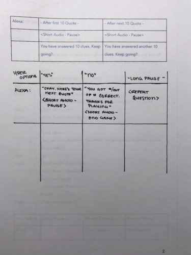
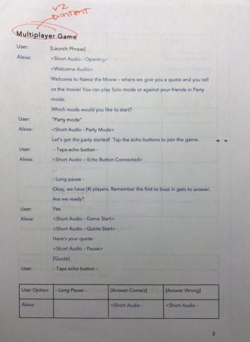
Now it’s time to imagine the conversation, from the start through to all it’s different options. I find it helps to constantly read your script out loud or with friends. It helps me to create more natural speech patterns. Once you have that (for the most part) figured out, you can create a “flow diagram.” This is what Amazon calls the visual representation of the dialog’s effects and responses between the user, Alexa, and the skill itself.
While going through Alexa’s voice user interface, I had to keep asking myself “is this really what I would say?” And I had to keep asking myself if I had accounted for everything that a user might say or do.
Getting everything down on paper (yes, paper) makes it a lot easier to keep everything straight. Thinking about my user’s requests being little shortcuts changed and broadened my perspective and altered how I would have Alexa respond. I even added sound effect notes in my script – made even easier when Amazon added a Skills Kit Sound Library (thanks Amazon).

For me, it’s refreshing to be challenged to think outside of the box (or phone) every once in a while. If you want more detailed information, I would definitely recommend Amazon’s developer site, which you can get to here. Creating a UX for Alexa (and mobile apps) is fun. Go try it!
And stay tuned for my updated post that will move into the Development phase of the skill – but let’s leave that for another day.


*

How to: Animate with Photoshop
Do you sell hot dogs?

